The Story Behind the Logo
The Brand Philosophy
Perfection may be out of reach, but improvement is always within reach.
At Perfect Etiquette, the word Perfect does not suggest flawlessness. It represents intention, care and a commitment to steady growth. Children are not expected to be perfect. They are encouraged to improve gradually, building confidence through guidance and practice.
Etiquette goes beyond rules. It reflects awareness, consideration and the ability to move through social situations with confidence and ease. It is about understanding how actions affect others and responding with thoughtfulness.
Being perfect is not the goal. Becoming more aware, more assured and more considerate each day is what truly matters.
This philosophy shapes every aspect of Perfect Etiquette. Growth is supported with structure and warmth. Confidence develops through patience and consistency.
Grace in growth sits quietly at the heart of the brand. Children are guided to develop steadily and naturally, carrying themselves with confidence that feels authentic and lasting.
Every element of the Perfect Etiquette identity was created with care and intention. The PE logo represents the beginning of a child’s journey shaped by structure and grace and steady development.
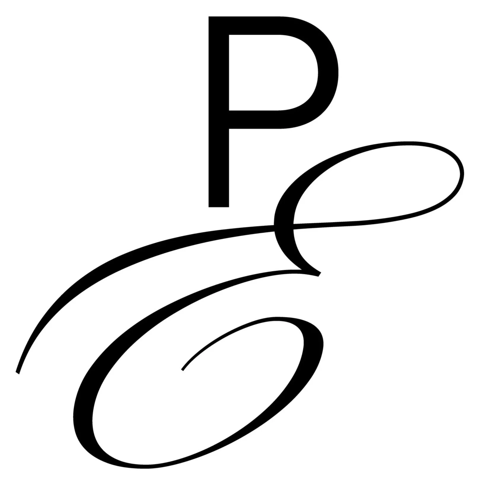
The intertwined P and E form a single flowing mark and together they create balance between strength and softness. The curved movement within the logo reflects how confidence develops over time. It grows gradually through guidance and practice and consistency.
The logo suggests motion rather than stillness. Like learning itself, development is continuous and refined.
A Sense of Movement and Growth
The flowing shape within the logo represents the journey children take as they build confidence, character and social awareness.
There is also a sense of elegance within the design which reflects the traditional foundations of etiquette. At the same time, the fluid form keeps the identity modern and relevant for today’s children.
The movement is intentional and poised. It is similar to the natural flow of handwriting or the gentle curl of a ribbon. Both are soft, controlled and purposeful.
There is also a sense of elegance in the design. This reflects the traditional foundations of etiquette. At the same time the fluid form keeps the logo modern and relevant for today’s children.
The movement is intentional and poised. It is similar to the natural flow of handwriting or the gentle curl of a ribbon. Both are soft and controlled and purposeful.
Typography and Balance
The typography reflects the philosophy behind Perfect Etiquette. An elegant script is paired with a clean modern font. Together they represent the balance between traditional etiquette and contemporary social skills.
This pairing supports clarity and approachability. It mirrors the way children are guided with structure, warmth and adaptability.
Why the Logo Matters
The logo is not decorative. It is symbolic.
It reflects the belief that confidence develops over time. Children grow best when they are supported with care and patience. When given the right guidance they develop a calm sense of self and carry themselves with assurance.
This belief sits at the heart of Perfect Etiquette and shapes every programme and lesson and learning experience.
Colour Palette and Learning
The colour palette has been chosen with the same care as the programmes themselves.
Green is inspired by nature and growth. It reflects a child’s natural development as they learn, adapt and build confidence. It supports the idea that progress happens gradually and at an individual pace.
White brings clarity and calm. It creates space for focus and reflection and supports an environment that feels reassuring and balanced.
Together these colours reinforce a sense of calm confidence and thoughtful structure centred on the child.